[TUTORIAL] The Ultimate Guide to name.com’s Website Builder

Last week, when we announced our special deal with name.com, I promised you a detailed guide on how to make a personal website, based on my own example using name.com’s handy dandy website builder. When it comes to having a website, regardless if it’s for a small business, an organization or yourself, the design and content is what makes it interesting and eye-catching, so here is what I did!
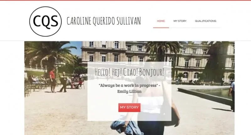
Here is my home page, how do you like it? We will have yours set up in minutes!
Step 1: Register your .ME!
With this bundling offer it was super easy. First off, if you haven’t already, go here to search for available domain names and register your .ME!
I picked a pretty simple domain name, my name, which I am beginning to use as a branding tool because it is quite distinct when having Q as my middle initial.
If your desired domain name isn’t available, the site will come up with a number of relevant suggestions. You want your domain name to reflect who you are since it will be your Internet ID. It is recommended to do FirstNameLastName.ME if it is for a personal website. If that isn’t available try to keep it short and sweet. For more tips on how to choose a perfect domain name check out our guide here.
From there on, [hypotext target=”connect”]connect your website builder to your domain name.[+][/hypotext] ← click to expand
You’re ready to start building! On to the fun stuff!
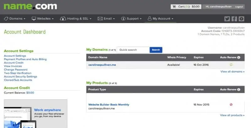
[hypotext id=”connect”]After you’ve gone through the purchase process and set up your account, you can pull up to your account page and see that you have your domain and your “Website Builder Basic Monthly” as seen in the picture below.
If you’re ready to dive in, click on the “Website Builder Basic Monthly” and from there you can set the domain name you purchased to the website by following these steps. Also, by pressing on the “Website Builder Basic Monthly” you can get to the editing page for your website, which is shown in the picture below.

All set? Let’s move on to the fun part![/hypotext]
Step 2: Layout
After you have made your way through the payment section and you open your website builder, the first thing you will be asked to choose will be the website layout. Don’t worry, if you choose one now, you can certainly change it afterward at any time! On the first page, you can click through all of the layout options and see what design elements they have to offer.
Layout and design are very important aspect to a website. Personally, it’s what makes me want to stay on a website or not. If it isn’t interesting or eye-catching, I will visit the site for just what I need and won’t spend extra time there. If the website layout is complicated to figure out, your visitors won’t think twice about leaving your page to find something that works easier. There are endless options on the internet, don’t drive your visitors away.
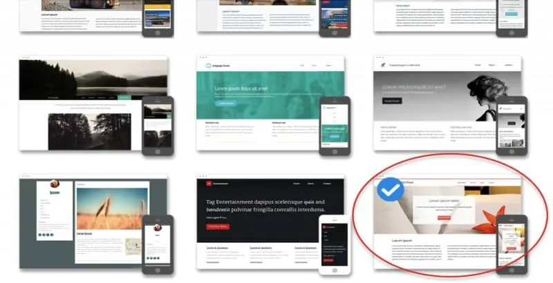
Name.com’s website builder offers 31 different templates and within those templates you are allowed 5 pages, 250 MB of storage, 5 free stock images and the capabilities of having a Blog and or Menu page! Each of their templates are mobile responsive so you can see right away how they will look on screens of different sizes.
Need some design advice? No worries, [hypotext target=”layoutadvice”]we have got you covered![+][/hypotext]
[hypotext id=”layoutadvice”]For my website template I chose, “Hotel Koya”. I primarily chose it because of its’ Salmon Pink and white color combination, which, of course, can be changed later. It drew my eye in so I just went with it. Generally, what you want to pay attention to is:
No clutter: What I also like about this template is the modern impression it has, nothing is complicated to navigate through. I absolutely love a clean look because of how easy and intuitive it is for visitors to use.
Color: Colors give off emotion and can easily influence your mood. If you are in a calm mood and then suddenly red colors are all around you, how would you feel? The color red increases blood circulation and stimulates the body and mind. The salmon pink and white gives off, to me, a feminine, modern. yet sophisticated look, which is exactly how I would like my brand to be seen! Pink is often associated with love, romance, youth, freshness which all depends on the type of pink. White is associated with purity and sterile. So, the combination of the two is a great way to express my brand.
This Website Builder allows you to can change the given colors. When picking a template you can see what groups of color each one offers. You want to properly advertise your brand.
Breathing Room: Make sure that not everything on your page is jammed together in one spot. This website builder provides you with divider and spacer boxes to ensure that your content isn’t right on top of one another.
Choose easy to read fonts: There are so many interesting fonts out there, but the more artistic that they get, the harder they are to read. When picking your fonts, make sure that they are easy to read.[/hypotext]
Step 3: Trial and Error
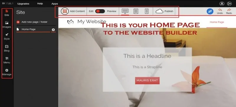
After you have chosen a template you will be pulled to your homepage, which looks like the picture below, with tabs on the left and on the top.
Now, you should know that I started building my website just by clicking around and I’m a true believer that trial and error is the best way to learn how something works…. or read a tutorial 😉
The site uses mainly drag and drop for adding content and I honestly think this is the easiest website builder I’ve ever used. The best part about it is, at the basic price there are really neat things that you can include.
When you start building your website you will have the template set up for you, and you can change anything within that. You’ll notice that when you drag the mouse over the website builder different parts will turn up light gray. If you click on it, you’ll be able to see what you can change or, you can go to the add Content tab on the top and Drag and Drop what you want specifically, and where (see below). Don’t forget all your tabs! The magic won’t happen without them.
To make it easier, we have prepared a [hypotext target=”cheatsheet”]cheat sheet for you[+][/hypotext] that lists all the tab options and their meaning.
[hypotext id=”cheatsheet”]Your Left Side tabs include Site, Images, Style, Blog, Menu and Manage:
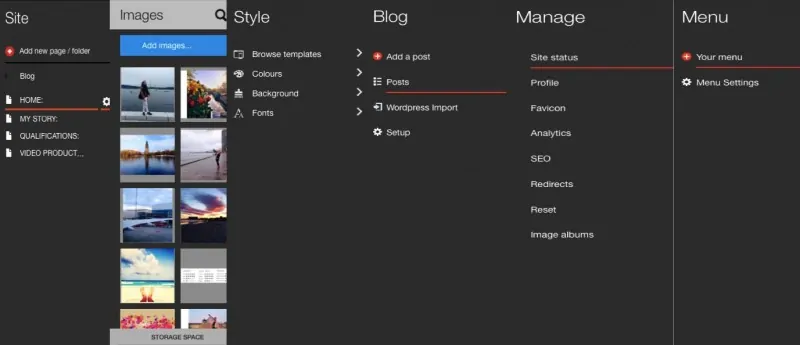
Site – This is technically your “Home page”, where you are able to click around and change content. On the tab itself you can add pages, and then direct yourself to then edit those pages. So, if you want to change your content on your “About” page, go to the site page and then click on it to change the information as needed.
Images – Where you can upload images. Don’t forget, you are able to “Drag and Drop” about anything on this website. Meaning that if you all of a sudden want to add a picture, you can do that by: “ Add Content”, pick “Image” and drag that box to where you want it, then upload the picture. Like I did, but we will get to that. 🙂
Style – This is where you are able to change templates, colors, backgrounds and fonts. Again, you are able to do this technically from anywhere by just clicking on what you want to change.
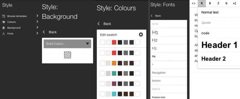
Important – All of the styles are going to “match” from page to page from what you make them be from this specific section. Meaning, when you set up your fonts on this main Font page and are then changing the font under the text box you will only be able to change the fonts to what you previously picked under the style: font page. See the picture above.
Blog – On this tab you are able to manage the updated blog pages that you post, if you choose to. Depending on what kind of website you are building you might be maintaining blog type posts.
– On this page, you are able to see what you have published and work from there. If you have a separate WordPress account you are able to import these files from WordPress to include on your new website as well.
– Under “Set up” you are able to choose different details about your blog and how you would like it to be maintained and managed.
Menu – Calling all restaurant owners! This website builder has a nifty section where you can add your menu, easily! You are able to add all menu details, food, details, price etc.! So, if you are just using this website for personal branding use, you won’t find any need for this tab, so just let it be!
Manage – Under the Manage tab you are able to do exactly that, manage your site. The first page that will pop up will be “Site Status” this is where you are able to attach the correct domain name, in the drop down menu. If it isn’t appearing there, follow the link below to link your domain name to the website. But, once you follow these directions come back to this page, you will have to use the drop down to attach it.
Also under the MANAGE tab you are able to manage your Profile Information, Favicon, Analytics, SEO, Reset, Redirects, and Image Albums:
Profile – Here you are able to include your logo, name, descriptions and contact Details etc.
Favicon – You can add your Favicon which is “A favicon is a small graphic that appears next to the web address in a browser’s address bar. The file type must be .ico. Some older mobile devices may be unable to display a favicon larger in size than 4KB.” You can choose your image, or again, drag and drop.
Analytics – If you are curious about what kind of traction you are getting on your website, you can sign up with Google Analytics and see the analytics for your site. But if you upgrade to the Pro of Business for your website builder you can get this included.
SEO – SEO stands for “search engine optimization”. With SEO you can traffic visitors to your site through search results on search engines. From this tab, you are able to manage what you what your SEO options to be for your website. If you want to read more about SEO, I found this post to be very helpful!
Redirects – Here you can control your traffic, if people pull up a certain page you’ve included in your website, you can redirect them to where you want them.
Reset – Careful! You only want to press this button if you want your site to be completely reset, meaning you loose EVERYTHING!
Image Albums – Under this tab you can upload images that you want to work with, so when you’re ready to include them in a specific spot you already have them uploaded. If you’re not a planner and not sure what Images you’re going to want to include, no worries, you can drag and drop them from you computer to the website builder when needed! If you for some reason are trying to add an image from another place and it is taking too long or just not working, go back here and upload it and then go back to the page where you want the picture.
Now, your upper Tabs!
From here you are able to add content, change back and forth from edit to preview and change the type of view you are seeing. It’s important to make sure your content looks good and is usable on all kinds of electronics, computer, tablet, and smartphones.
The last tab includes your publish button! This is what you press when you are ready to go live!
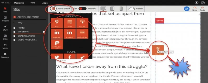
Add content – This tab lets you add specific content and put it where it should go or where you want it to go by dragging it to an allowed empty area (these often show up as you are dragging with a blue dotted line). Once you click on the “Add content” a scroll menu comes up, where you can add specific information and it already has it set up, all that needs to be done is put on your website. The nifty part is, there is so much to a website that you may forget what to include. For example, on my “My Story” page, I included a comment box, where individuals visiting my site can email me right from there!
It’s important to know that you can drag these orange boxes to where you want the information! I wanted to attach my Linked page to my “Qualifications” page, so, I clicked on the “add content” scrolled down to LinkedIn and dragged it into the right column. Now, if you want the columns to change in size, pull your mouse over the text box and you will see it turn gray where you are given options. If you click on it, it will change the text, but as you see in the picture below, there is an icon with three columns, which ration you can change. You can do this separately on any page.
You are able to add lots of different things to your website all by clicking, dragging and dropping! So easy.[/hypotext]
Step 4: Adding Content
Although catchy colors and cool effects grab readers attention content is the core of a website. Content is what a visitor goes to locate, so you want to make sure it’s strong and impactful. When building a website there are three universal must have’s to include:
1) About Me
When having a website, regardless if it’s a personal or business website you should always have a section explaining who you are and what you’re all about. This section can be hard to complete for some people, and it was for me. I tried to focus on what I would people want to read if they were considering hiring me that they couldn’t get from my CV. Write about something that you do or something that grabs your interest. If you are really struggling to write something about yourself, take the time to read this to get started.
For my About Me, I split it up into two different sections. On my homepage, I included a snip bit about what my personality is like and how traveling is as major influence on my whereabouts. Then, I included a “My Story” tab where I gave visitors the option to become a little more familiar with who I am by including a personal story. The personal story isn’t necessary for you by any means, but I wanted to express something that you don’t necessarily put smack dab in the middle of a resume. Capture your visitors’ attention by giving details or something unique that makes your website personal to you and your visitors.
2) Work Reference
You can write whatever you want on this website, but you want people to believe what you are saying. If you are writing about how good you are at graphic design, include something that you have designed to back up what you’re saying. For my website I didn’t specifically mention one quality that I specialize in, so including the link to my LinkedIn gives the opportunity for visitors to “check my references”.
3) Contact Info
The point of your website is for people to contact you, no? So, you should certainly have your contact information on your website. I included my email, social media accounts and link to my LinkedIn page. You can give as many outlets as you want for people to contact you, but just make sure you at least have one included, preferably your personalized email.
Depending on what your website is for, the content is going to vary. I decided to make mine into a personal website that could essentially be a virtual resume and interview. Now, I understand that the content is the most important part but what you might need reminding of is that, on the first try it’s OK if it’s not perfect. The creative process is just that, a process!
Since I decided to make my website a personal website and the intentions of the website are to have somewhere to send future employers to, the information is staying strictly business but with every intention of giving them the opportunity to get to know me better as a human being through the information that I provide them with. Then, from there it can evolve into something else. Who knows, maybe one day I’ll have my own company and it could have all grown from this website!
On my home page I added [hypotext target=”additionalcontent”]3 things on top of the original template.[+][/hypotext]
[hypotext id=”additionalcontent”]Map – I decided to add the map because recently my life has constantly been on the move. Right now I am in Montenegro and come December I’ll be in the U.S., and then January I’ll be back in Denmark for a bit. Therefore, if someone was to visit my page I want to give them a sense of what my life is like or at least close to it. I spend a lot of it looking at a map, whether it’s moving somewhere for school purposes or planning a trip.
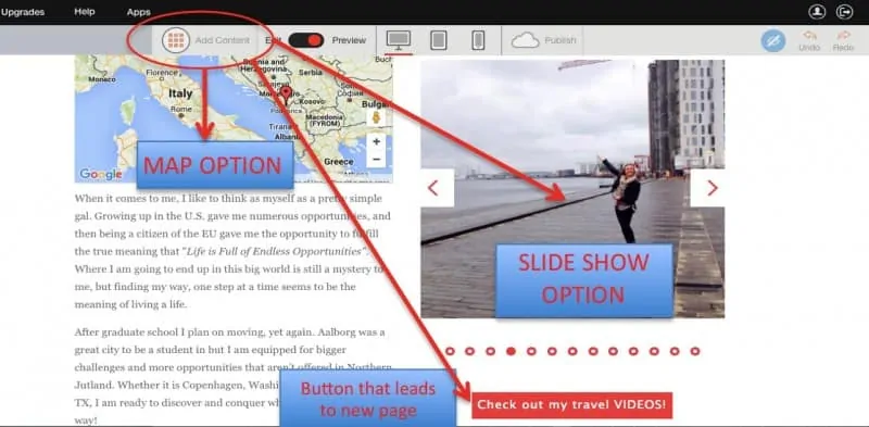
Slideshow – I absolutely love pictures! I feel like pictures grab the attention of people. With this slide show option you’re able to show many pictures in one spot instead of taking up a whole page. For me, this was perfect! There is also the “image” option where you can put one image on a page or there is the “gallery” option where you can put several in one place.
Button – So, I discovered the button on the template on the home page and I thought it was really neat! I created a “secret page” where the button could lead to, instead of having it on the home page tabs of the website. Or, you can add a button to go to an external link, for example, a Pinterest Board.
Contact Form – Although at the bottom of each page my email is listed for contact, I thought it would be nice if someone needs to send me a note that they could do it right from the website without even having to open their email. One less step for them means the bigger the chance of someone actually sending me an email right now. I have no clue what someone would want to email me about, but If they do, the option is there!
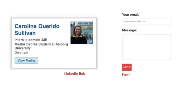
LinkedIn – On my “Qualifications” page I thought it only made sense to add a link to my LinkedIn page, well luckily enough this Website Builder has a set up for that.[/hypotext]
What is something I did not add but would certainly recommend? Blog. I am a total perfectionist and have tried blogging multiple times, but I wasn’t OK with sitting down just for 30 minutes or less to write something quick to keep it updated. I am constantly getting stuck in the awkward stage of figuring out what kind of blogging schedule would suit me. While I am finishing up grad school, I have had to prioritize and, unfortunately, the endless reading and writing for school has taken precedence for now.
Step 5: Listening to your instincts
There is so much that you can do on this website builder, that it’s important to keep in mind what you want your brand to be. Make sure that your brand expresses your personality but take into consideration the design tips that I shared. It is pretty exciting when you press the “Publish” button! This website builder even lets you re-edit after you’ve gone live, and remember, we are always here for any questions you may have!
Back to you! How did your website turn out and what did you like about this Website Builder?
[click-boxes title=”What to build a website of your own?” text=”Get a .ME domain of your choice and first-month free website builder for just $5.99!” link=”https://www.name.com/me-bundle?utm_source=BlogPost&utm_medium=New&utm_campaign=MEandWebsiteBuilder15 ” color=”a6171d” button=”Get Started!”]