The Siren’s Call of a Well-crafted Call to Action

Editor’s Note: This blog post was originally written in June 2016. Some things have changed since then, so we decided to update the post accordingly.
Imagine buying the finest fishing equipment you can find, investing a lot of time and effort into putting it all together so that everything fits perfectly, doing your diligence when it comes to finding an ideal fishing spot and basically, making sure you’ve covered all possible bases, only to realize that your bait is woefully inadequate.
That’s almost exactly what happens when you do everything imaginable for your site, but fail to devote enough attention to your call to action (except in the digital context, it’s not fishing but lead generation, not bait but byte, and when you talk about strings, you’re more likely to be referring to characters than the fishing line).
It is okay if you want to make sure your business website is presentable, filled with eye-catching graphic and search engine friendly meta elements. Just don’t forget that the ultimate goal is not to have visitors come to your page and admire your craftsmanship – it’s to have them convert. So, the critical junction is your landing page, or, to be more specific, your call to action!

What the heck is CTA?
If you’ve been in marketing even for a second, you’re already familiar with the “call to action” term. Yes, it’s any message that encourages an immediate response or sale. You want your visitors to share their email address, provide a feedback, download your eBook, or proceed to checkout? CTA is your best friend because it allows your visitors to do anything you want them to.
[su_box title=”The ultimate goal is not to have visitors come to your page and admire your craftsmanship – it’s to have them convert.” box_color=”#ffffff” class=”trap small left”][/su_box]
You probably have a solid grasp on what works at your market and with your audience. However, if you think that your first attempt at making a perfect call to action will also be the final one, trust me – it won’t! You’ll need to perform a lot of testing before you can say that you’ve done everything to ensure maximum conversions.
That being said, to even get to the testing stage, you’ll need the first draft. In order to help you create one, we’ve listed the most important aspects of an effective call to action, along with some examples to help illustrate the point.

Button Size and Color
Do you know the secret formula for designing a perfect call to action? Prominent without being obstructive, standing out while still fitting in. Okay, that sounds as difficult as rocket science! The whole point of the call to action button is to attract visitors’ attention and serve as a portal to conversion. It means you’ll need to do a lot of testing and I promise that after a couple of attempts you should start getting the hang of it.
- SIZE
You can experiment with the size of the button, depending on your needs. While some won’t hesitate to make it large, others prefer the more subtle approach and leave the copy and page layout to direct the visitor’s attention somewhere else.
- COLOR
Just like with size, there seem to be opposing schools of thought when it comes to the coloring of the call to action button. While some are adamant about only using the colors which contrast with the background the most, others claim that it’s more important for the button to correspond to your branding palette.
You can try to reconcile these approaches by a skillful choice of background coloring, but, as is often the case with matters as delicate as this one, compromise can leave you bereft of the benefits of either choice and only accentuate their failings.
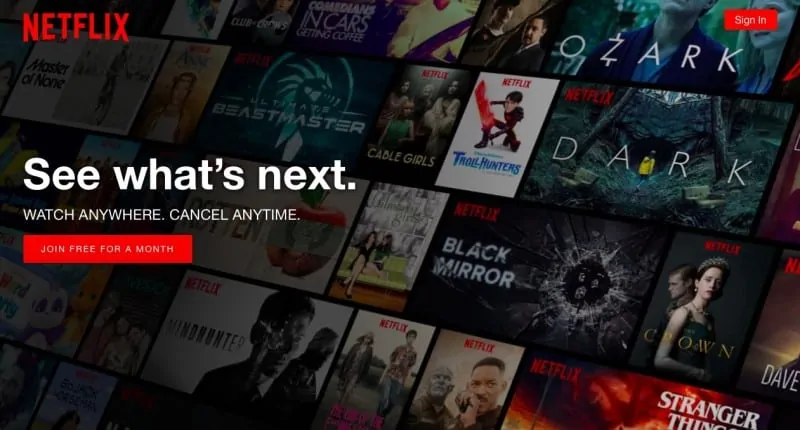
Netflix pulled off the proverbial “not going to the theater but still watching your movie”. Their call to action is consistent with their branding, but it also makes a sharp contrast to the rest of the page. In this case, the approach actually works.
Positioning
It would be nice to say that we have reached a point in the article where we can say that we have straight, unambiguous advice for you. However, once again we have to deal with “if-then”. While it makes perfect sense to keep your call to action above the fold where it can be seen without scrolling down, it also stands to reason that you can’t ask your visitors to commit to anything without first explaining what they would be committing to. In other words, if you manage to present your case in the limited amount of space you have above the fold – perfect; if not, it might be better to move the button below the text explaining what exactly is it that your visitors stand to gain by the fateful click. If your offer is compelling enough, people shouldn’t mind having to do a bit of extra scroll-work.
[su_box title=”The secret formula for designing a perfect call to action: Being prominent without being obstructive, standing out while still fitting in.” box_color=”#ffffff” class=”trap small right”][/su_box]
Using any sort of visual cues (in this case, the actual image of the product) is one of the ways to ensure that your message gets out loud and clear, even without lengthy explanations or pitches. Naturally, if you are a major brand, you can count on your reputation to do the work of elaborating on your offer, but if you are relatively obscure you’ll need to find a way to hook your visitors without writing an essay on why they should join the prestigious club of people who clicked on your link. Sometimes, more is less. As you can see at the example below, the combination of visuals and words can send a very clear message.

Persuasive Copy
All the visuals in the world can’t help you if your copy is subpar. While every decision you’ll have to make when drafting a call to action should be based on the way people perceive and react to things, knowledge of human psychology is perhaps the most essential when choosing which words to use.
When asked about his progress on Ulysses, James Joyce famously quipped: “I have the words already. What I am seeking is the perfect order of words in the sentence.”
[su_box title=”With .ME domain name, you can create an awesoME call to action!” box_color=”#ffffff” class=”trap small left”][/su_box]
If you approach the copy for your landing page with the same kind of dedication and perfectionism, you should do fine, regardless of the graphics, button position, etc. The text you’ll rely on to generate conversions needs to be succinct and to the point, but still, capture your uniqueness as a brand.
Domain Name
Yes, you’ve heard right! A domain name can serve as a perfect call to action. There’s one important thing you have to have in mind when creating your business domain name – a website visitor will not read 1000 long word description of who you are and what you offer. And that’s where a domain name can help! For example, vizualize.me clearly invites you to try some catchy graphics, the lost and found things are screaming return.me, and if your blog needs some makeup, there’s themify.me! Find out more about all the call to action tricks you can do with .ME: Use .ME: Build a MEmorable Business Brand.
Being slightly edgy can backfire horribly if you’ve done a bad job of assessing your audience. However, if you know who you are catering to and truly understand the way they think, even a very basic pun can get the job done. The best way to create the call to action button that does its job is to get to know your audience and to try to offer something they can’t get elsewhere. Creating a call to action domain name definitely is a win! You already have an idea? Check out if yours unique .ME is available here!