Mobile-Friendly Website for Free Are Easy – Just Ask (And Use) Mobilizer.Me
Did you know that Google, the most popular search engine in the world that’s responsible for a lot of the people coming to your website, prefers mobile-friendly websites? If your website isn’t mobile-friendly, you need to act fast, because Google’s “mobile-friendly update” went live at the beginning of the year. One web app that could help – for free mind you is Mobilizer.Me, which you can use to create a mobile friendly website and optionally convert it into a full-fledged iPhone or Android app.
Wait, So Mobile-friendly Means…?
For a website to be mobile-friendly it needs to be viewable on modern mobile devices, such as iPhones or Android phones. With more and more people accessing websites on their mobile devices, Google wants to make sure that the results that it shows them is not only relevant, but also optimised to read while walking or in-between “Tweet storm” sessions.
This is why starting April 21, Google expanded the use of mobile friendliness as a ranking signal, which means that having a mobile-friendly website can have a significant impact on the search results it appears in. And that’s where the recently launched Mobilizer.Me comes in.
As it names says, Mobilizer.Me will let you “mobilize” your website – creating a mobile-friendly version of it quickly and easily. While Mobilizer.Me doesn’t use magic, it does use a simple web app that you click through to create an app-like mobile website in minutes.
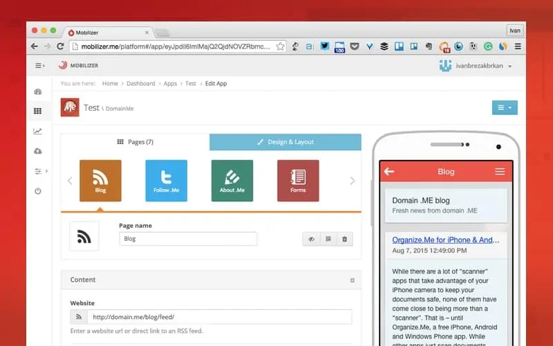
After signing up with either your email, Facebook or Twitter account, you’ll be asked to create and name a new app. The next step is going through two tabs, that are organised as the content (Pages) and visual (Design & Layout) segments of the app.
Pick a Design, Add Your (Mobile) ‘Pages’
Although Pages is positioned first, I would suggest going through the Design & Layout screen first since you’ll have fewer options to go through and it will make adding the content easier later on. You can choose from over a dozen layouts, 4 navigation schemes and a dozen background. You can also add your own background, as well as a custom icon. The icon will either then be used as the bookmark icon when a user wants to add your mobile website to their home screen, or as the actual app icon if you end up converting it to a format friendly to iOS or Android.
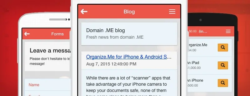
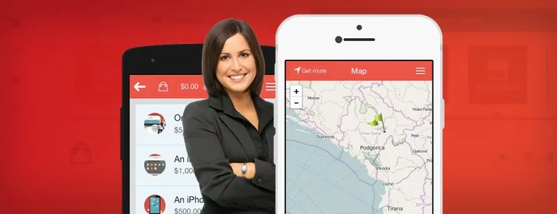
After you decide on the look (don’t take ages, you can always edit it in the future), switch back to Pages to start adding… pages of content. There are a couple of dozen page types, such as static content (About Us, Content, etc) but also social media pages, a (simple) webshop, video pages as well as integrations that let you add maps or forms. You can choose from a few hundred icons for each of your pages!
In our case, if we add a form page, we can choose its name and then add the form content through an easy-to-use editor. We can add form elements such as different fields, as well as add a success message that will be shown to the user after they submit their answers. Keep in mind that most of the page types are still pretty basic and won’t give you any additional options. For example, some stats about the submissions would be useful, but Mobilizer.Me’s forms are still a good start!
While Mobilizer.Me pages might not have stats of their own, the platform does let you follow statistics about the use of your “apps” for a given period. Think of it as an integrated Google Analytics, giving you insight into how (mobile) users are clicking on your Mobilizer.Me app. It’s definitely a useful way of comparing how they use your offering when compared to users on traditional computers.
Publishing Your Mobile-Friendly Website
Remember: Your Mobilizer.Me “app” isn’t a native iPhone or Android app, it’s still a website. One that will let you avoid the fate of a number of Fortune 500 websites that weren’t mobile friendly, mind you! Your users won’t have to download it so you have two options of integrating it into your existing website. Both require a bit of code editing, but will give you a mobile website to use instantly.
The first is redirecting mobile visitors from your desktop website to your Mobilizer.Me mobile website with a snipper of code you’ll find under the app navigation option “Redirect code”. You just have to paste the code in the <head> section of your desktop website.
https://www.youtube.com/watch?v=L0GLiyyoSBo
The other option is “downloading the app” – its html code to be exact – so you can upload your mobile-friendly Mobilizer.Me website to your hosting and have it located where the rest of your website is stored. While this keeps everything on your “turf” you won’t be able to edit the website remotely so any changes will end with you re-downloading the code and re-uploading it to your website.
If you decide that you want a native iOS or Android application, you can go one step further and use the downloaded code to convert it into a native app using a number of technologies such as Cordova, PhoneGap, Intel XKD or Ionic CLI.
Price? All the Apps!
Mobilizer.Me is pretty affordable with the solution being free for one app with any of the pages options, while you can create an unlimited number of mobile-friendly websites for just $12 a month. Interestingly enough, the author of Mobilizer.Me, Regedanzter, did share a tip on Product Hunt that you don’t need to pay when upgrading: Just close the PayPal windows after it pops up and you’ll still get the upgrade!
If you can’t wait to get your mobile-friendly website up and running or just don’t have the time to make your whole website responsive, give Mobilizer.Me a shot. With it’s webshop, news, photos and other widgets, it might suprise you what you can create!
