Freelancers: Let’s talk about your About page

I’ll go straight to the point here: The About page is one of the most important pages on your website.
This is not a part of your website to ‘get over with’. If you want to distinguish yourself from your competition and stand out as someone who has a strong personal brand, then you need to invest time and effort into your About page, instead of filling it with an uninspiring, monotone bio.
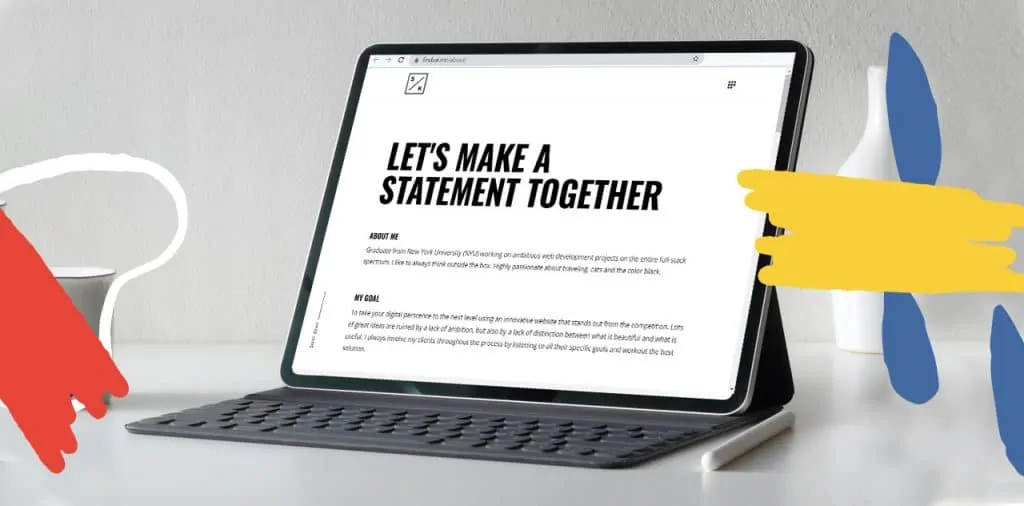
The about page (or page section, if you have a one-pager website) is your chance to introduce yourself to your audience and acquire new clients.
We asked some well-established freelancers from our .ME community to share some tips on how to make your ‘about me’ description stand out and attract clients.
Myths Surrounding The About Page of a Personal Website
There are many myths surrounding how about page should look and what elements it should contain. One of the most prominent myths tells a tale of just how complex your about page should be. Seeing how just how much one can benefit from having a well-composed about page, we’ve decided to go on a myth-buster rampage. Are you ready?
Myth 1: You Can Only Talk About You
Of course, your About page should contain relevant information about you and your work. However, keep in mind that about page does not limit you to talk about you only. Instead of going on and on (or keeping it too short), you can tell the potential clients about your process and what value they’ll receive from contracting you. Think in terms of telling your audience how you can help them solve a problem. Make them a part of your story.
Myth 2: You Should Put A Photo of Yourself
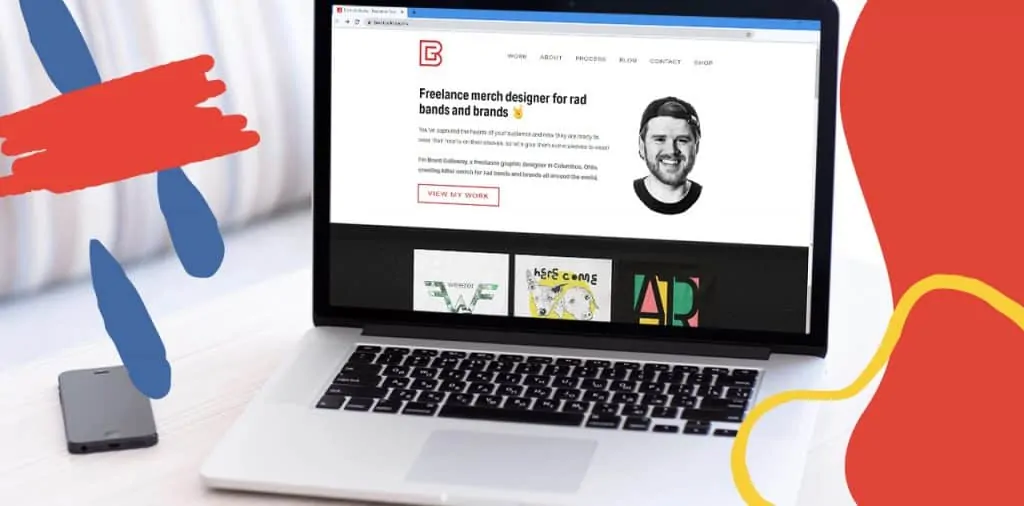
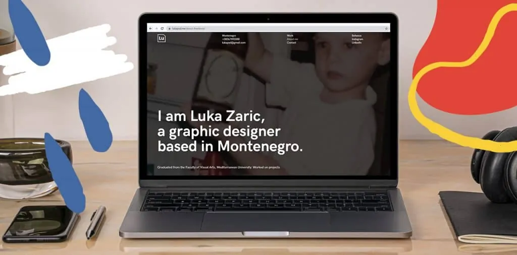
Some among us value their privacy beyond anything else. They also cringe each time someone tells them to include their photo in the about page. Sure, we all prefer to put the face to the work, but this is not an absolute rule. Instead, you can include an illustration of you, animation or maybe a photo of something relevant to you or your industry. If you only have a problem of showing your face, then you can place a photo where your face is not in the focus.
It is recommended that you include a picture to follow the story of who you are, but there are many creative ways to do so.
Myth 3: Keep it Minimal
A fair warning: This myth applies to some professions. Here is why.
Let’s say you are a writer. A visually pleasing website is welcomed, but you don’t want it to capture all the attention. Instead, you want your audience to focus on your words. However, let’s assume you are an animator, illustrator or developer. In this case, your focus should be on finding the balance between introducing yourself and demonstrating who you are through your work. In other words, your about page should be visually attractive.
Keeping the design of your about page minimal and clean is always a good choice unless it hurts showing the world just how awesome you are.
Contents of A Great About Page
Now, let’s be honest, the best-told story is the one which is not complex but straightforward, engages the reader and keeps them guessing. A well told story can also show your expertise and build trust with your audience, and it is the foundation of your about page.
1. Storytelling

Great storytelling is the basis of engaging your audience. It’s your one-way ticket (besides your portfolio, of course) to distinguish yourself from the crowd. So how do you tell the story about yourself?
It’s understandable if your first reaction is “I AM NOT A WRITER!” Cool. Writing a paragraph or two about what you do and what you can offer to the audience is important for placing keywords and having people and search engines find you on the world wide web. But, you are not required to write an autobiography. Instead, use the tools and skills of your profession to show the potential clients who you are.
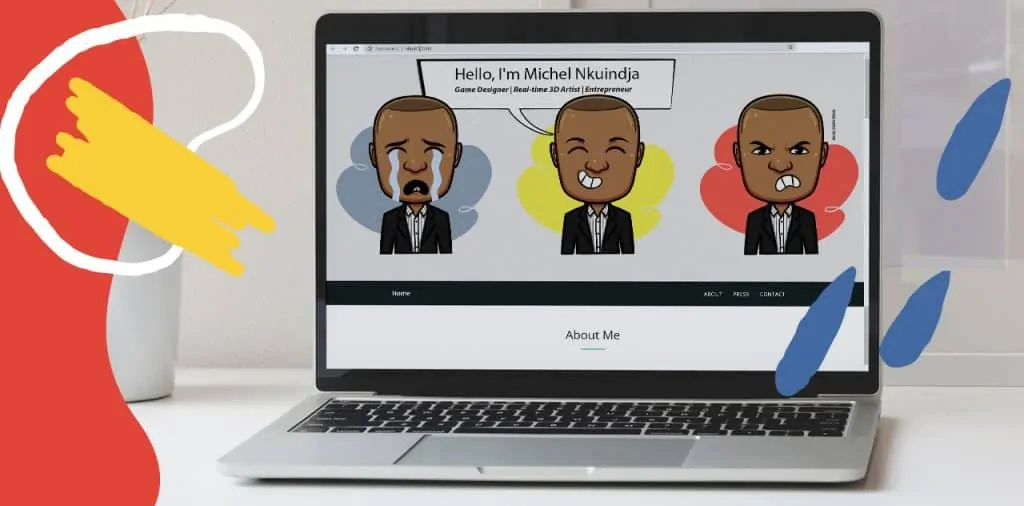
You are an animator? Great – make a quick animation of who you are, how come you are an animator, what you can offer to your clients.
You are a developer, you say. If you fall into a trap of ‘I’m pretty much similar to everyone else”, then how about you create a character that would represent who you are and can guide the visitors and tell them what your skills and expertise are.
An About page can inspire your target audience to trust you by showing that you’re reliable and have a proven track record. Have someone revise what you’ve come up with, and don’t forget to include relevant keywords!
“One of the most neglected parts of a personal website is the about page. I’ve seen countless websites (including mine) missing story as the key element of the page that is both your selling page and the foundation of your brand. This is exactly what I am working on right now
Ognjen from Ographics.ME
2. Include All Relevant Information
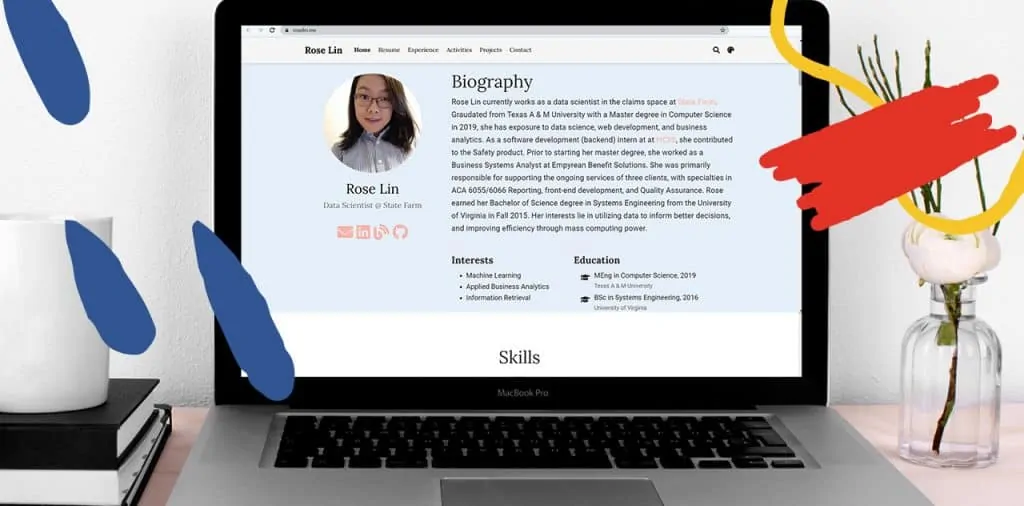
There are some of us who are not comfortable talking about themselves, especially in front of a wide audience. That’s ok. We are not asking you to tell us about your first highschool crush, but it would be wise to include all the relevant information about your professional side. What does this mean?
Well, in a nutshell, tell us:
- Who you are
- What you know
- How well you know it
- What can you do for your clients
- And something relatable about you to show your human side
Don’t forget to include a headline (which will contain the keyword, hint: your profession). Also, be careful not to boast too much, and keep it sweet and short unless you have a great story to tell!
Include personal values! I think that including any values, ideas, the inspiration that one shares. This makes a long way to show one’s personality and way of working!
Anita from Alfianita.ME
3. Call to action
We cannot stress enough how important a call to action (CTA) is! Think of the CTA as you prompting your audience to go on, check out your work (if they have not already) and contact you for collaboration! You can link your CTA to your portfolio, the best blog post that can generate conversions, your contact information and the like.
Whatever you choose your call to action to be, test it out with your friends and family before deciding on it. Your CTA should be engaging and guiding your audience to explore your site further and/or contact you.
4. Visually Pleasing and User Friendly
We are all fond of visually pleasing objects and tend to gravitate towards them, websites included. Pair a visually pleasing website with a user-friendly one, and you’ll hit a jackpot.
Just in case you are not familiar with what a user-friendly website entails, here’s a quick list of things to pay attention to.
- Check if your website is mobile-friendly by accessing your about page from a smartphone.
- Your information should be organised and presented in a neat and most logical way.
- Your content should be well formatted and easy to read.
- Make sure your page loads quickly. No one likes to wait.
- Check for the browser consistency – does it appear the same in all browsers?
- Have you implemented effective navigation on your about page?
- Well paired colours and contrasting colour scheme.
The usability of a website plays a vital role in whether someone will decide to explore your website further and ultimately make a conversion. Double-check your about page for any inconsistencies regarding user-friendliness.
Your pages should be fast, people don’t want to wait for your high-res JPGs to load. Make things as easy and fast as possible for who is viewing your website.
Murilo from Murilo.ME
Before You Go
Here is one last piece of advice. Learning about how your visitors behave once they access your website can tell you a lot about things that can or need to be improved and those which should be highlighted. How can you learn about user behaviour on your website? Easy!
Connect your website with Google Analytics. By using this simple and free tool, you’ll be able to see the demographics of your visitors as well as their geographical location. But more importantly, you’ll learn which pages bring in visitors, how long the visitors stay on those pages and where they go next.
Another thing you might want to consider is a heatmap. This is a tool that can help you see visitors’ behavioural flow that will paint the clear picture of how visitors engage with your website pages.