Best Business Websites to Inspire Your Own Launch [.ME Selection]

Estimated reading time: around 10 minutes
Ah, the excitement of starting a business. You’ve done all the planning and set your growth strategy straight, and now you’re eager to see in which direction will it all develop. Being an entrepreneur can truly make your heart pump, but it’s no easy task – especially because your to-do list is probably going to be endless.
And what is one of the first things you need to tick from this list?
That’s right: your business website. The cornerstone of your online presence, the main touchpoint customers have with your brand, the most precious means for controlling your online presence, and possibly your biggest revenue channel.
However, it’s often challenging to create a website that reflects the essence of your business. Coming up with the website structure that’s clear and straightforward implies a back-and-forth process, especially if you’re trying to figure it out by yourself or do it on the budget.
The vast possibilities of what your website could look like can seem daunting. At one moment, you’ll probably feel like you just want to launch the goddamn thing already.
This is why we decided to gather some of the .ME business websites from different industries and reverse-engineer what makes them great. Hopefully you’ll get a clearer idea of what you want to do with the online home for your business.
Let’s dive in.
1. Business Website Inspiration for the Travel Company: Srprs.me
If your business is focused on offering amazing traveling experiences and you can’t figure out how to make the website equally lively and exciting so that it aligns with your mission, we invite you take a look at Srprs.me.
Srprs.me is driven by the idea that there is beauty in meeting a certain place spontaneously, without control freaking and thorough planning. The team is responsible for organizing the trip for you and choosing the perfect destination based on the preferences you point out in the questionnaire.
Seems awesome, right?
We agree. But, given the fact all of the bookings happen via the website, the company needed a visually appealing solution and an intuitive, user-friendly design in order to make it work.
Srprs.me has actually gone through rebranding recently and we at Domain.me feel it’s straight bullseye.
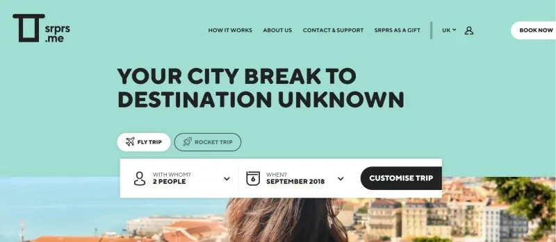
The moment site visitors open up the website, they encounter a clear menu with the following categories:
- How it works
- About us
- Contact & Support
- SRPRS as a gift
These four sections are all that a person needs in order to inform herself about the company.
In addition, there is an element that’s visually pointed out, on which BOOK NOW is written. This CTA is cleverly positioned and it shortens the path between the first contact visitors have with the website and actually booking their trip. If you click on it, you get instantly redirected to the form where you can customize your trip, i.e. point out your deal breakers and preferences.
Colorful design, font choice, and visuals that reminiscence retro cartoons all fit well into the Srprs.me narrative.
Read more about Srprs.me on our blog.
2. Business Website Inspiration for an App: Keepy.me
If you’re trying to figure out how to display all the awesome features of your app, you might want to check out Keepy.me.
Keepy is an app that helps parents all over the world to save, organize, and share their kids’ artwork, photos, or other type of mementos. It brought us a simple, yet innovative way to preserve precious childhood memories and nurture the family relationships without creating paper clutter or any type of mess.
So, here’s how the website is organized.
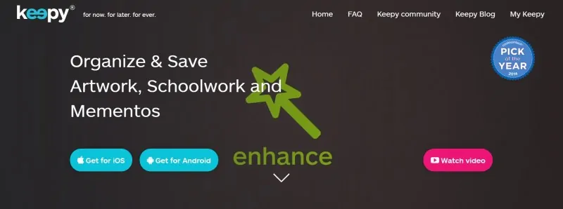
The first thing that pops right in front of the website visitor are the two bright blue buttons that are actually CTAs:
- Get for iOS
- Get for Android
Then you’ll notice the “Watch video” bright pink button that, once you click on it, triggers the pop up for a short explainer video of the app.
The menu is divided into five sections: Home, FAQ, Keepy community, Keepy Blog, and My Keepy, enabling the visitor a clear view of all the website sections. Social media contact pages are in the footer of the website, which is a common practice.
But, what makes this website an awesome example for the app-focused sites?
As you scroll down, you’ll notice the horizontal structure that alternates the display of the selected screenshots and text, forming a zig-zag layout. This brings more dynamic to the scroll and hooks the attention of the visitor.
This is a great way to list the app features and provide visitors with an overview of what they can actually do with the app.
Scrolling further, there are another two CTAs positioned here. Dynamic slider of company logos that already use the Keepy app, give additional business credibility.
Read more about the Keepy app on our blog.
3. Business Website Inspiration for Social Entrepreneurs: Nowmoney.me
Is your company more focused on making a real impact than making a profit? Then you need a website that’s designed so that it clearly communicates both your mission and values.
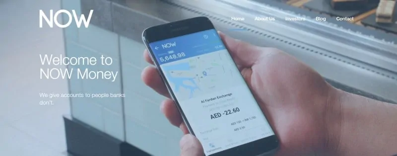
Check out nowmoney.me for inspiration. NOW Money utilizes the latest financial and regulatory technology in order to make banking accessible to those who need it, i.e. to the unbanked. Shortly put, they are a financial inclusion company with a specific focus on the banking needs of low-income migrant workers.
One of the biggest challenges is to sum up the purpose of your social entrepreneurship in a sentence or two. In the case of NOW Money, it’s rather simple:
We give accounts to people banks don’t.
This statement is powerful enough to draw the site visitor in and yet – it’s concise and precise. As you scroll down, you can choose to familiarize yourself with the story from the perspective of either
- Companies
- Account holders
Switching between the two is easy and the design is intuitive and simple. Homepage is not too crowded with content, but it does contain strategically layed out CTAs, so to motivate visitors to explore further and navigate through other website pages as well.
Displayed awards and clear benefits for the account holder are there to showcase credibility and build trust, which is especially important given the fact the company operates in a very sensitive industry – finances.
The choice of colors and shapes matches the overall brand feel NOW Money has created. Given the fact social entrepreneurship implies humaneness and warmhearthiness, the design had to step away from the cold, corporate aesthetics that are typical for banks and financial institutions.
When you start building the website for your own company that also fits into the social entrepreneurship category, think about the power of visual and the key information visitors might be looking for when they encounter your site.
Read more about NOW Money on our blog.
4. Business Website Inspiration for a Product Company: Earwear.me
And what if you’re a product company? Don’t worry, we’ve got you covered. Introducing the inspiration fuel you need, website Earwear.me.
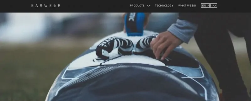
Once you open up Earwear’s website, you have to choose your desired language and country before getting redirected to the site itself where the true magic happens.
The logo and font choice are sophisticated and techy, which aligns with the product itself. Namely, Earwear are personalized ear plugs which are based on an advance technology and custom-made for various different purposes.
Dynamic slider on the homepage enables you to explore various scenarios in which Earwear plugs can be used. All of the visuals (plus one video enriched with music) create a warm feeling and weave the story around the brand.
As you continue scrolling, you can browse through different categories that are wonderfully organized:
- Earwear for music
- Earwear at work
- Earwear for sports
- Earwear to relax
The photographs used for each of these sections fit in nicely and respect the overall aesthetics of the website. Further on the page, you can find exclusive designer lines and testimonials, along with CTAs.
So, what’s the greatest thing you can learn here and possibly use for your own website? Make it personal. Show your customers you understand their pain points and that you have a specifically tailored solution for them.
Read more about Earwear on our blog.
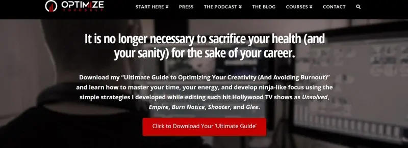
5. Business Website Inspiration for the Infopreneurs: Optimizeyourself.me
If you’re an infopreneur, the most important thing for your business website is to showcase your methods or consultations truly have value and have helped others prosper.
We invite you to learn a thing or two from Optimizeyourself.me.
The key thing here is to
- Clearly display testimonials
- Include press clipping
- Offer valuable incentives for free (not only will this help you showcase the value of your work, but it will also support your efforts of creating and nurturing meaningful relationships)
The founder of Optimize Yourself, Zack Arnold, has ticked all of the above mentioned off the list within his website. His choice of colors (black and red) are associated with hi-tech, progressiveness, and the notion of future – all of which fit pretty well with the core essence of his business.
Website categories enable easier navigation through the site, as they offer the needed info about the format of knowledge available. Be it podcast, course, or article post – you know exactly where to find what you’re looking for.
Plus, Arnold has a “Start Here” section, which is smart for at least two reasons.
Firstly, it gives site visitors additional guidance and help towards prioritizing website information. Secondly, it’s actually a smart tactic, as people get directly drawn to the product section. So, you’re actually gently pushing relevant prospects through the sales funnel, towards making a purchase.
Read more about OptimizeYourself on our blog.
Over to You
We hope it is a bit easier now for you to picture your website in your head. If you need more inspiration, you can check out our Success Story section on the blog and snoop around successful .ME businesses in order to get your creative juices going.
Once you get everything in order, you know what you have to do, right? Choose a great domain name that’s easy to remember and truly represents your business in the best way possible.
Check out our guide for choosing the best domain name for your business and don’t you even dare to think it’s not important.
Needless to say, you can count on .ME as the most personal domain name across the web for your online home!
With .ME, you can create an incredibly unique and creative domain name that’s impossible to forget or even a savvy CTA that will create an emotional bond with your target audience in no time. Check if your .ME is available and launch your business website today!