Mobile Marketing: How Your App Icon Should Look Like to Get More Downloads
We’re all friends here, but let’s be honest for a second. How much time do you spend thinking about visual identities of the companies, apps, and services you use every day? Sure, there’re some logos we don’t forget easily, like the Coca-Cola and Ford logos.
But did you know that the way your app icon looks has an effect on the overall number of downloads you’ll reach? It’s pretty simple, but we’ll try to give you some valuable advice that you can use on your next project right here, right now.
First things first. If you’re in the app business, you probably know of the insane size of that market right now. If your app is going to be iOS-only, your competition is pretty large, counting more than 2 million apps. For Android, that number is slightly larger, with around 2.2 million apps being available on the Google Play store. With gives us short of 4 and a half million apps, trying to make it on the same market as you.
The Design Is Extremely Important
The trick here is not to get overwhelmed and lose hope just because there are millions of other apps available. The key to your success will be the quality of your app and the love and hard work you put into it, but unfortunately, none of that will really matter if your visual identity isn’t good, which is a lesson we can all learn.
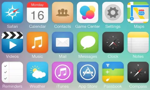
Slideshare, Tumblr, Pinterest, Etsy, Instagram, and Flickr are all founded or co-founded by designers. Why does that matter, you ask? Well, because the design way of thinking made their startups into some of the most popular in the world, and earned them a whole lot of money in the process. Sure, that has a lot to do with the functionality of the apps they made, but take a second and look up the app icons of Pinterest and Flickr, for example.
[su_box title=”Your App icon needs to be memorable, easy to look at, and innovative.” class=”trap small right”][/su_box]
The first thought that comes to your mind is that they look pretty cool, right? If you compare them with some of the icons some of the more “questionable” apps have on both app stores, you will be quick to find out that the actual icon of the app has a lot to do with the way people perceive said app, and in turn, how they behave.
Code Magazine wrote about the user experience of the apps you make, and the influence that it has on the user. Sure, there’s a lot of apps that do the same thing, but the apps that are set apart from those are set apart for a reason, and that reason is both the user experience and design, more times than not.
Instagram Logo: The Drama
You can get a clue about how important the visual identity of your app (and its icon) really is if you remember the latest Instagram logo update. It took with it a change for all of the Instagram-based apps, like Boomerang and Layout, but none of that mattered to the people who simply wanted their old icon back.
Mashable was among the first ones who thought the new app icon “sucked”, and hated the change. They cited that the icon is too much “in your face” and that it looks like it demands attention. They also said that it looks like it slants to the left, something I personally don’t really see. This only goes to show that the app and its icon are connected in more ways than simply saying “hey, this is the app.”
![]()
If we are to seek design knowledge anywhere in the world, there would be few places more suitable for that than Apple. This is precisely why we think that you should really take some advice from Apple’s designers when they tell you that the biggest deal about app icons are two things:
Beauty and recognisability.
Your app icon needs to look great and be cool in its own way. Sure, Instagram’s icon doesn’t look that great to some of us, but for me, it’s pretty nice-looking, albeit a bit soulless. Still, it’s very recognizable, and that’s one of the reasons I’m leaning heavily on it for the purposes of this text.
Everyone knows about Instagram!
Experiment, Innovate, Have Fun!
[su_box title=”According to Apple’s designers, the biggest deal about app icons are two things -beauty and recognisability.” class=”trap small left”][/su_box]
One more thing that you need to know about when designing your new app icon is that the icon is there to catch attention, and it sure won’t do so if it’s bland and dull, and the shape on it is so simple it makes you yawn.
That’s why you need to draw inspiration from the likes of Messenger with its lightning logo, Flipboard with its weird “F” thingy, Clear with its great gradient and Vimeo with that fancy V logo. All of those will stick with you long after you’ve actually seen them and will make you more likely to download those apps.
![]()
From my own personal experience, I really do tend to download apps that look and feel great, even if they lack some minor functionalities. That’s precisely why I love using Asana on-the-go and Teamwork at home. Asana’s app icon just makes me fall in love with it every time I see it.
If we were to tell you something you shouldn’t do, our advice would be to avoid photographs, as they are the very last choice one would make when working on an icon for your app. The reasoning behind this is simple: if your icon is a photograph, people simply don’t know what they can expect from the design of your app. “Will there be more photos everywhere? What’s your logo? Why are you doing this? “are some of the things people will wonder.
[su_box title=”Design is extremely important – just look at Canva and Vimeo!” class=”trap small right”][/su_box]
A blog post by Michael Flarup called Designing better app icons notes that there are some key things you need to know when thinking about your app icon:
- Don’t use words, as you have ample space to do so with your app name
- Keep it simple, and don’t try to make an app that can do everything at once
- Think of the details, and be patient
- Make your icon consistent throughout the app
- Stand out and innovate
- Add borders to make your app icon looks great on all backgrounds
Intuitive, Smart and Fun – Goals For Your Icons
One of my favorite app icons is surely the Brewski.Me app icon, which looks like a tasty pint of beer but still doesn’t quite show a handle. It’s cool, it’s intuitive and original, and it’s worth recommending to your friends.
![]()
You see, great design isn’t just making things look good but rather making them memorable for months and years to come. If your icon isn’t memorable and original, you risk being buried in the depths of the app store of your choice, and your desire to make more apps will probably diminish like that last brewski you had.
Aside from loving some beers, we think that every app should definitely deserve its own domain, and we strongly suggest that you take .ME into account when you design your next app, and its icon. 😉