AdamKaplan.Me – A little Something About Adam, Responsive Design and Grid
Most of the time, we present you .me domains that are fresh startups, businesses that are viable for quite some time or apps that could change your life. As you know, .me domain is extremely susceptible to word play so there are quite a few of domains that are using it in playful ways. But one of the domains is right to the point and simple: Adamkaplan.me. With that, Adam is simply saying “Adam Kaplan, that’s me.” and using the .ME domain in the most personal way.
Simple and Elegant
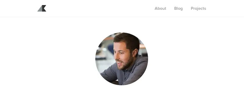
Adamkaplan.me is a home page for Adam Kaplan, a designer and a geek. He is currently working for 8thLight in Chicago as a UX Craftsman. Graduated with Bachelor of Arts from Columbia College, he worked as a video editor before he discovered coding and studied under Stephanie Briones, where he learned to keep his designs simple and easy to use, and that is clearly visible from the very first click. His .me page has three parts and all of them are expendable upon clicking.
The shortest “About” section is pretty much self explanatory, The “Blog” is a bit bigger with expandable posts, and the most interesting one is the “Projects” section. As a person who had about as much contact with coding as there are dust specks on your eyelashes, found my self completely drawn to it. Maybe it is the simplicity of the design, maybe it is the simplicity of Adam’s explanations, but reading about design and coding suddenly wasn’t rocket science.
Responsive Design
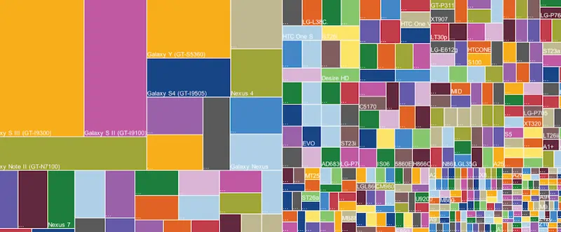
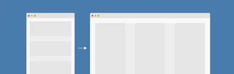
Recently, one thing started quite a buzz and Adam explained it in a way everyone could understand. Grid is a lesson about responsive design. Why should you learn something about that? Well, if you are professional you probably know about it, but if you are newbie like me, it is helpful in a case you need your own website. In short, it is a way of laying out your design so it can adapt to any size of the screen. There are thousands of monitors on a thousand of devices with several different browsers, and not all of them are created equal.
By creating “mobile first”, you start with layout for a small, mobile screens and layer on styles for larger screens as needed. In a way, you make themobile layout the default and there will be no more wonky displays of your page on small mobile devices, because you don’t have to override other styles. In a way, your page will recognize the width of the monitor that is displayed on, and build up the complexity and size of it, from smaller to bigger. In the end, it will allow older, slower and smaller devices to load the page quicker.
How To Do It?
To speed you through the process of creating a style that will be a responsive design, here are the steps:
First you add the viewport meta tag that and place it in the <head> of your HTML will enable use of media queries for cross device layouts. Then you use box-sizing: border-box that proves that bugs can be features one day.
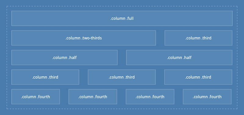
Third, you create a container that holds all the elements and controls the page’s maximum width. After that you create a column with block, their size with float: left and then create rows with clearfix, because columns are wrapped in rows, so it will top other elements from stacking to columns. After that you add .flow-opposite to columns to appear first on mobile, but on the right on larger screens.
Adam Kaplan used .me domain in the best possible way and Adamkaplan.me is excellent example how you can put a .ME domain to good use. It is not only for corporations, startups and apps, but for real people that need space for their portfolio, bio, thoughts and advices. What are you waiting for?
